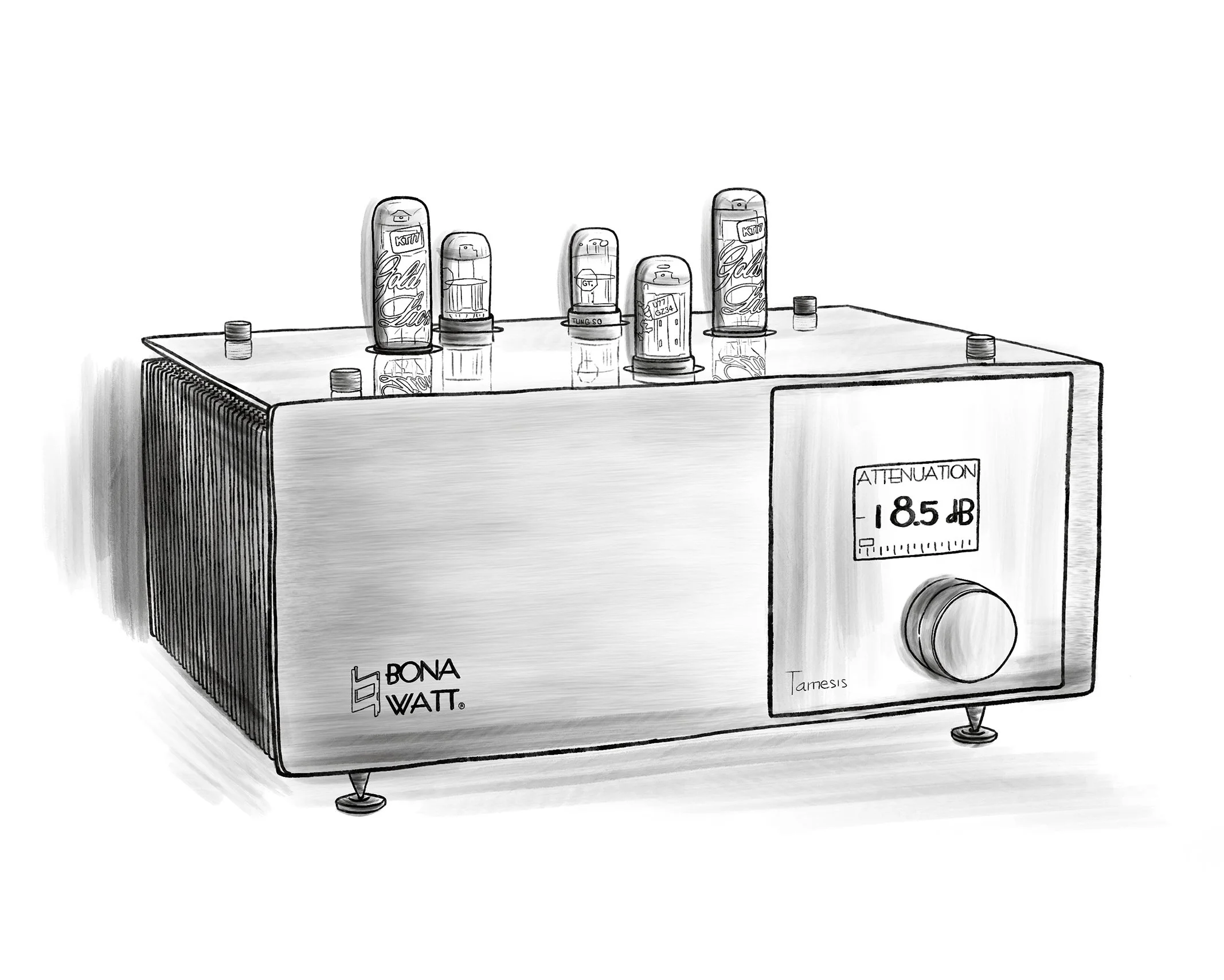
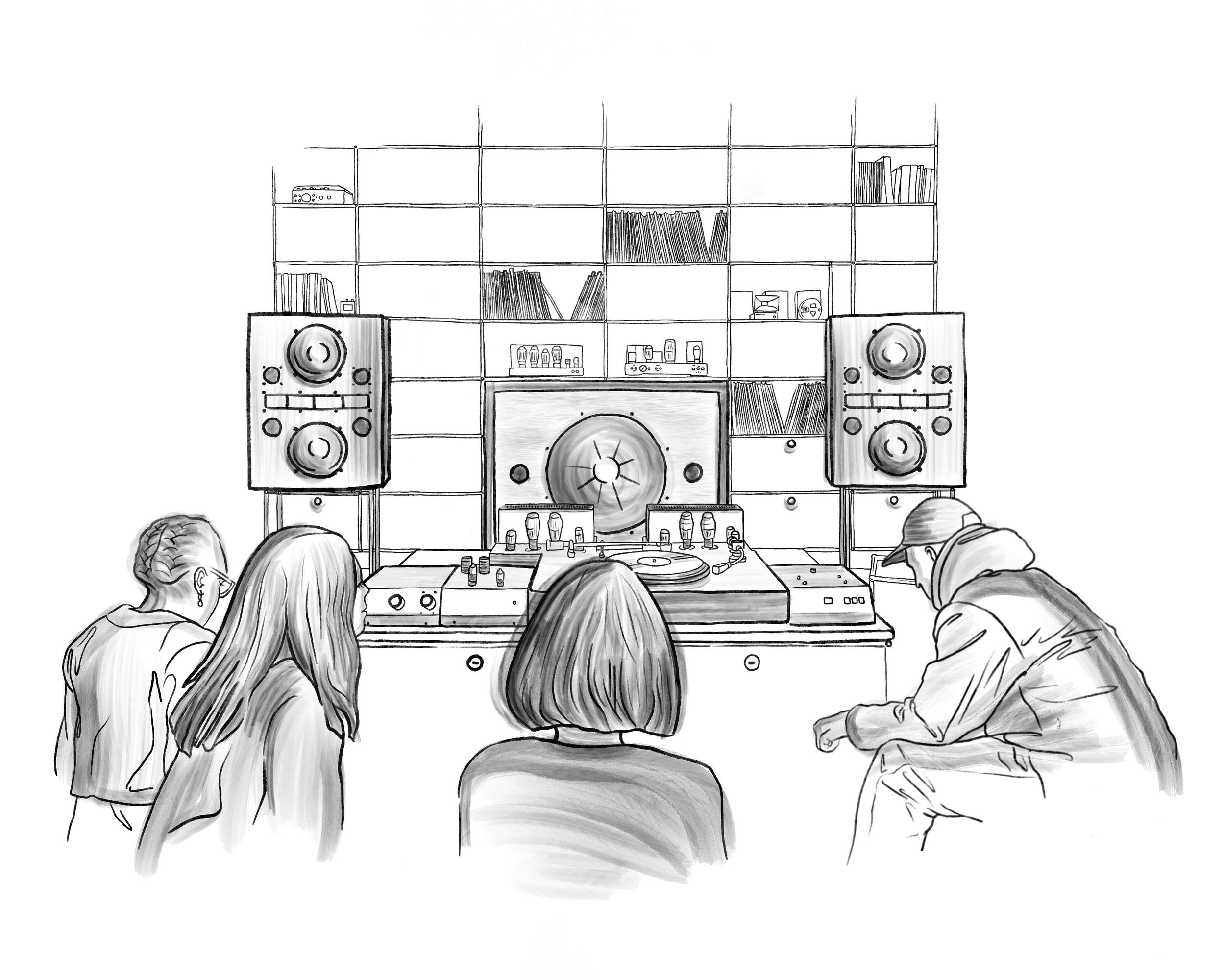
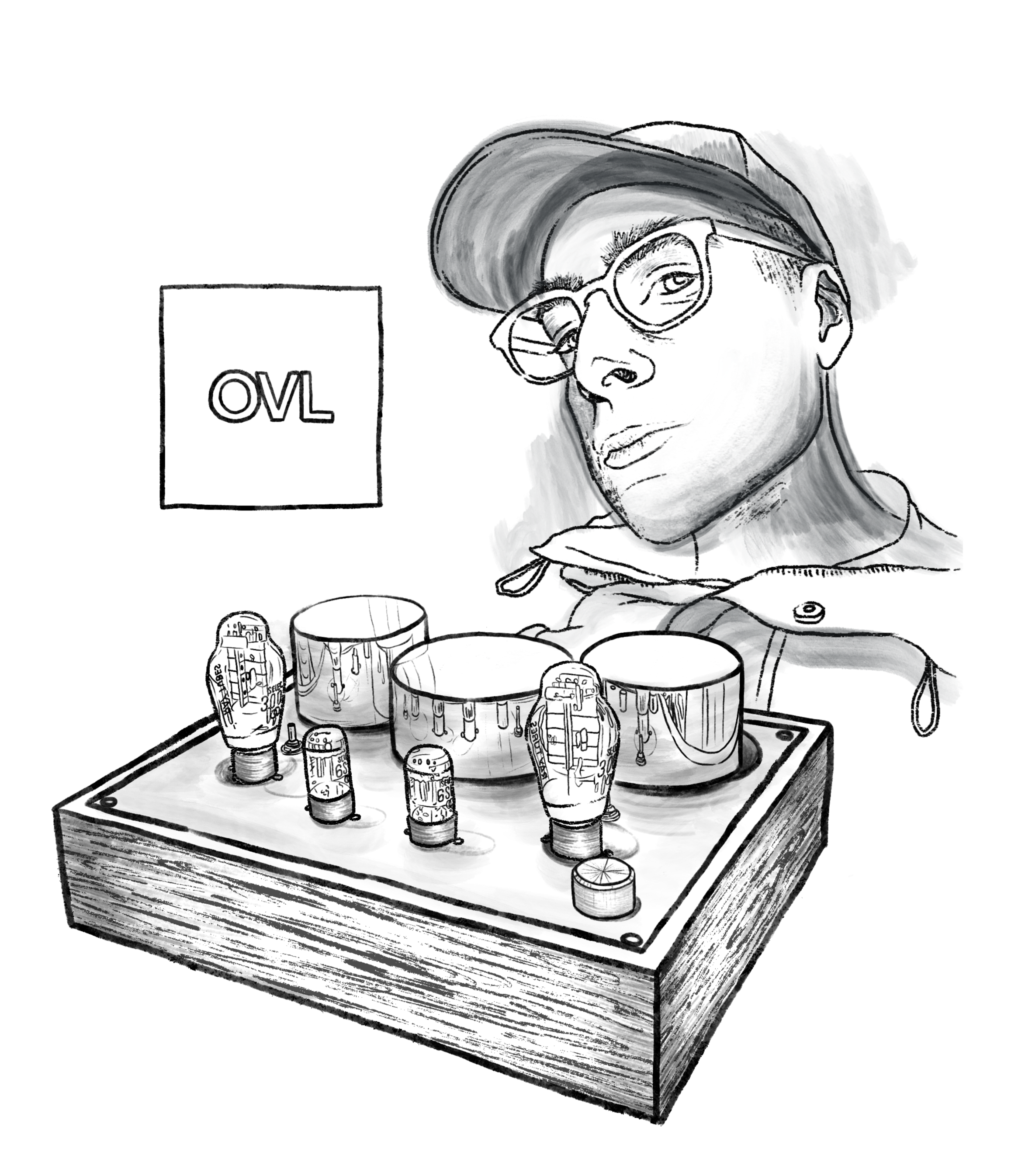
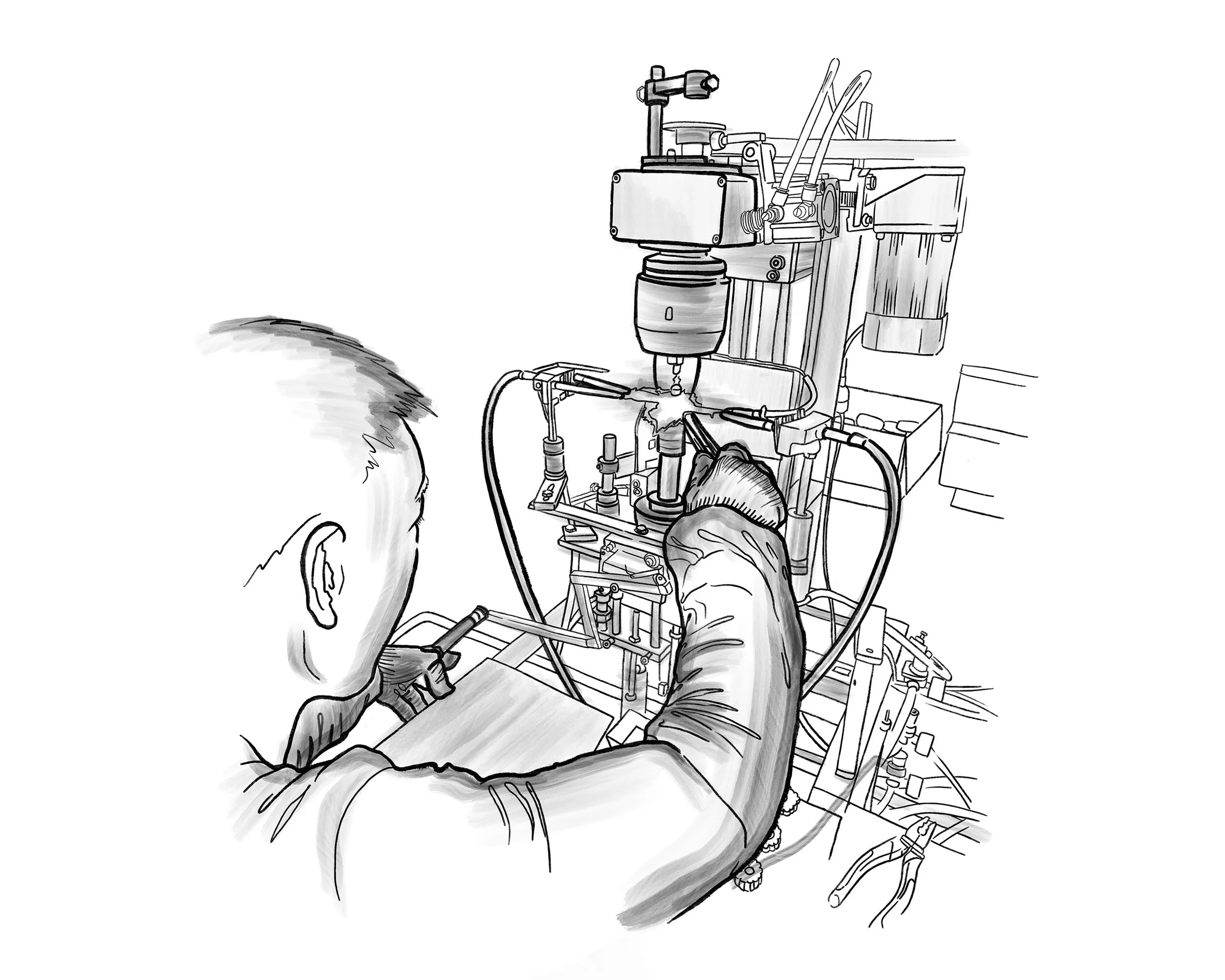
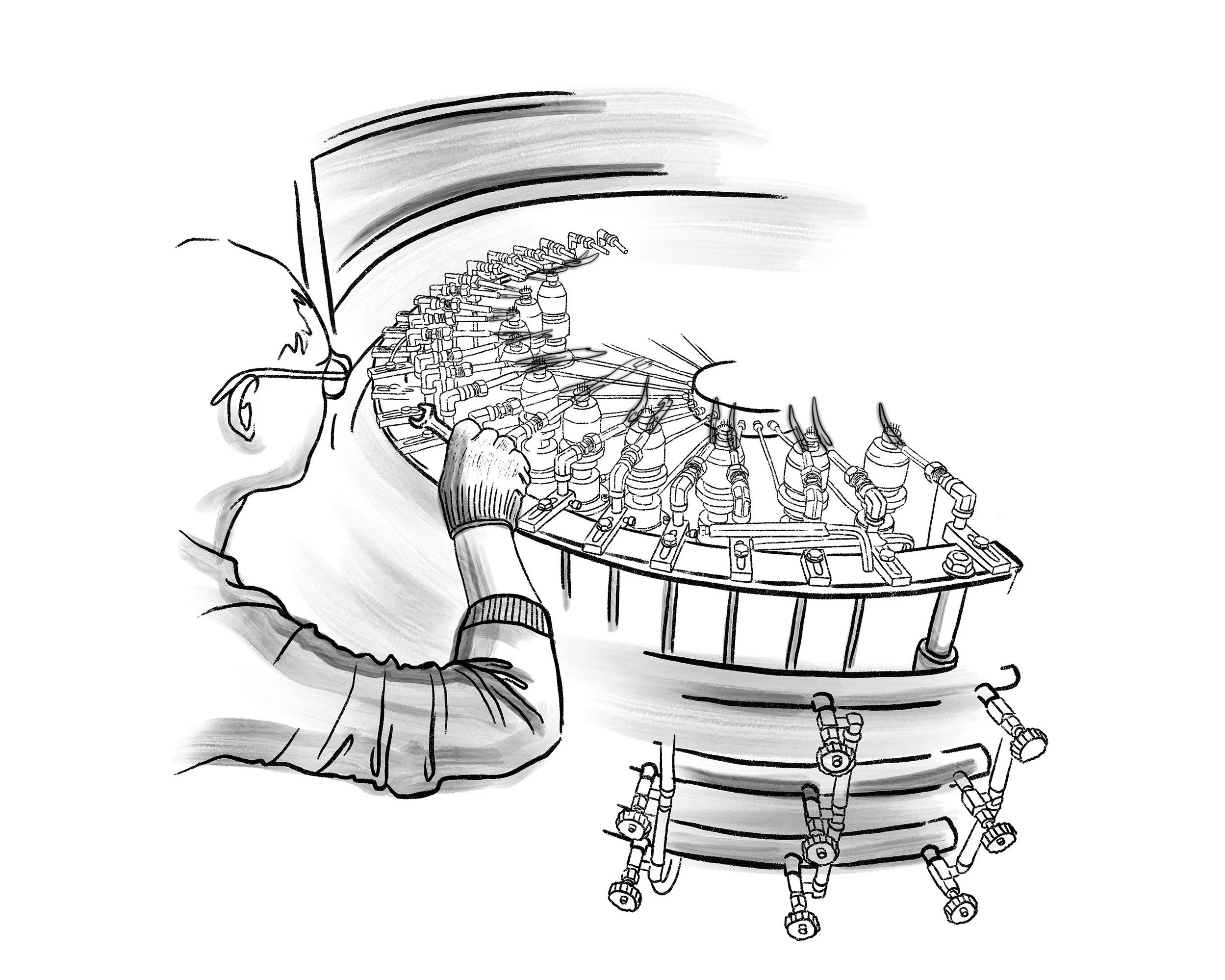
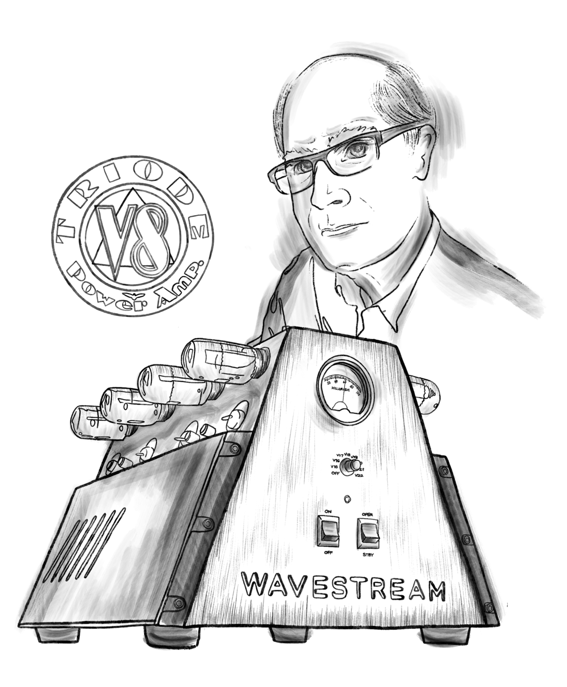
DIGITAL ILLUSTRATIONS
CLIENT: RAY TUBES, an audio vacuum tube specialist based in Canada, crafting premium products for audiophiles.
PROJECT PURPOSE: Hand-drawn illustrations for web pages and social media channels, elevating the
brand world and building cultural resonance through original content.
DISTRIBUTION: Website, blog, Instagram
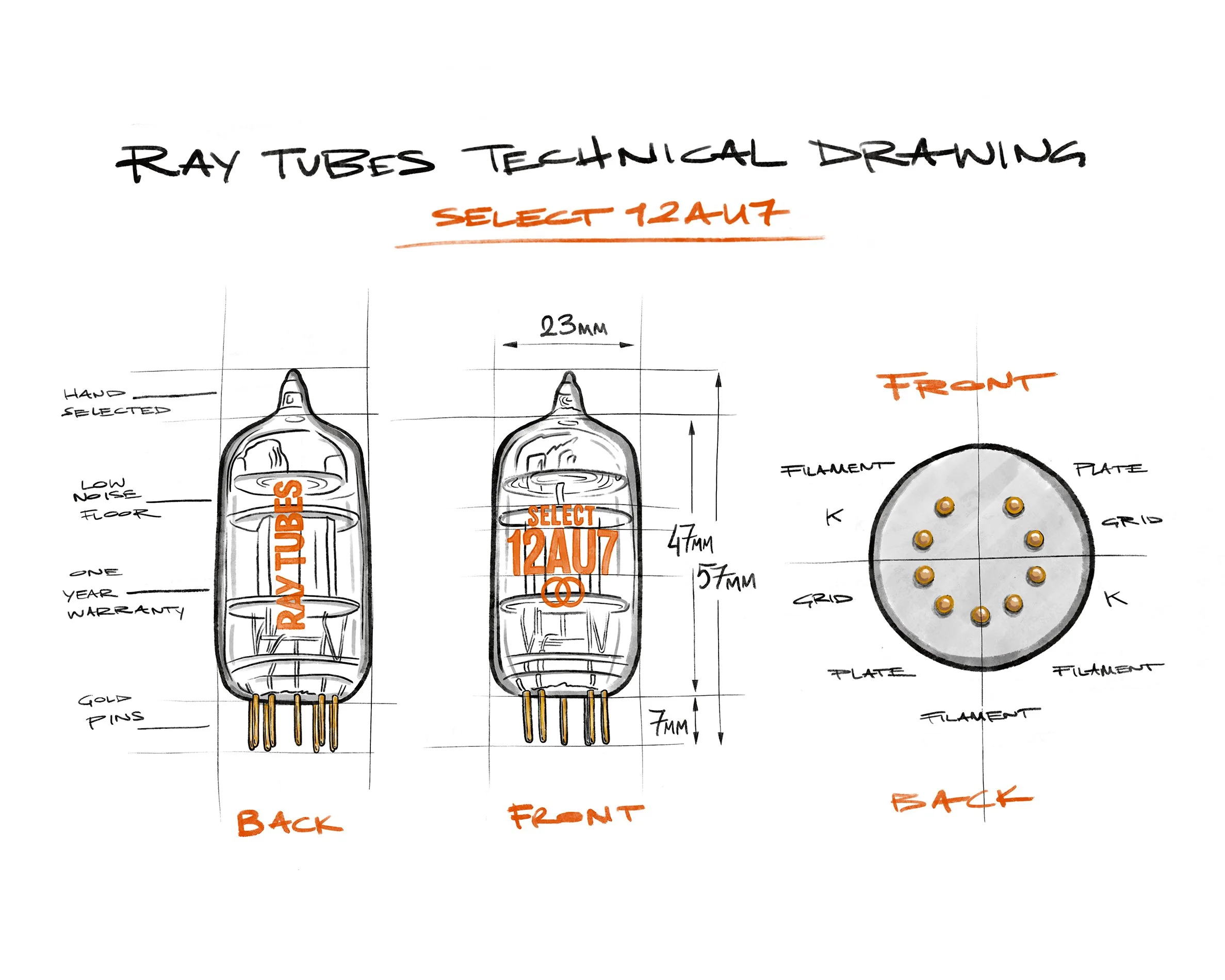
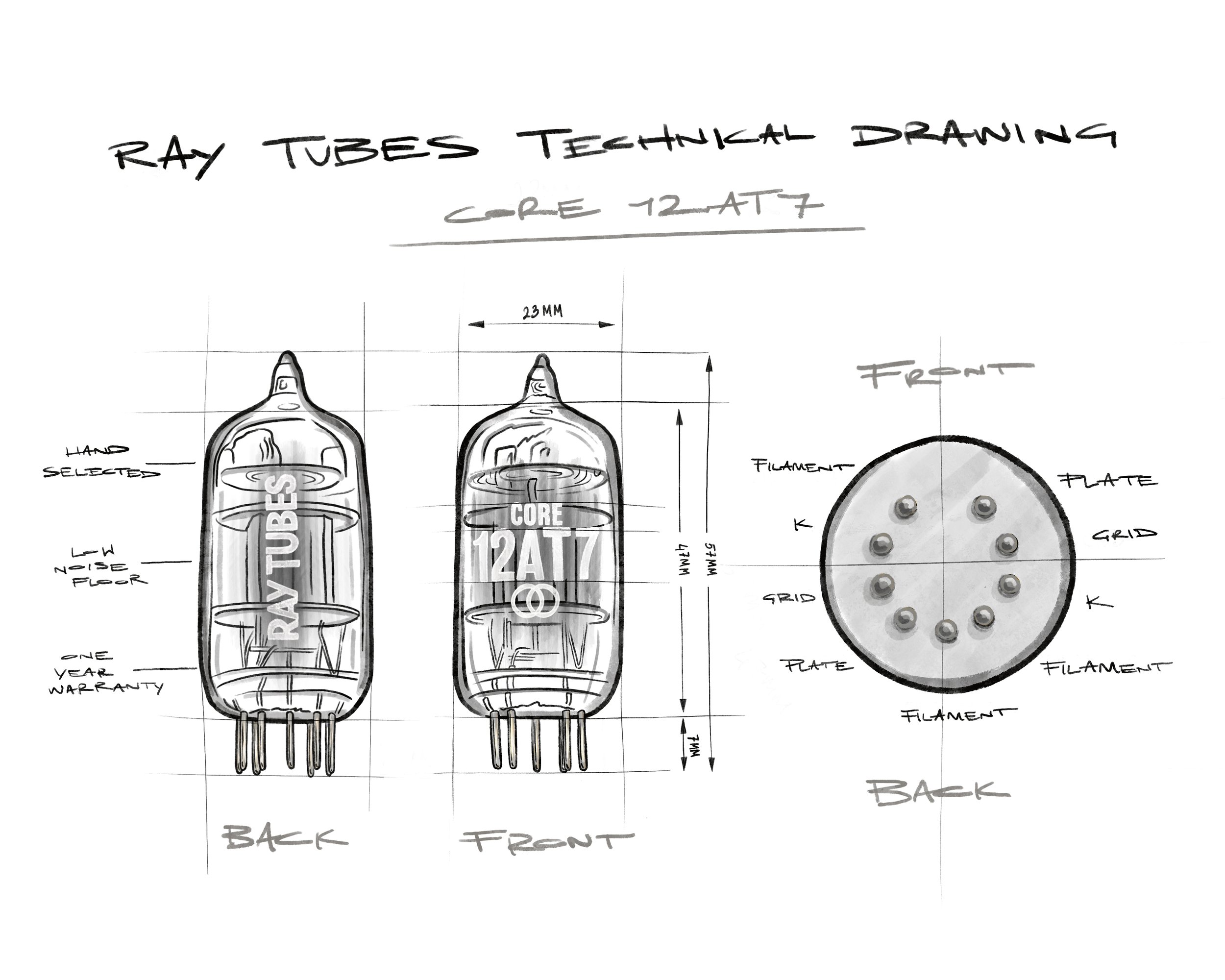
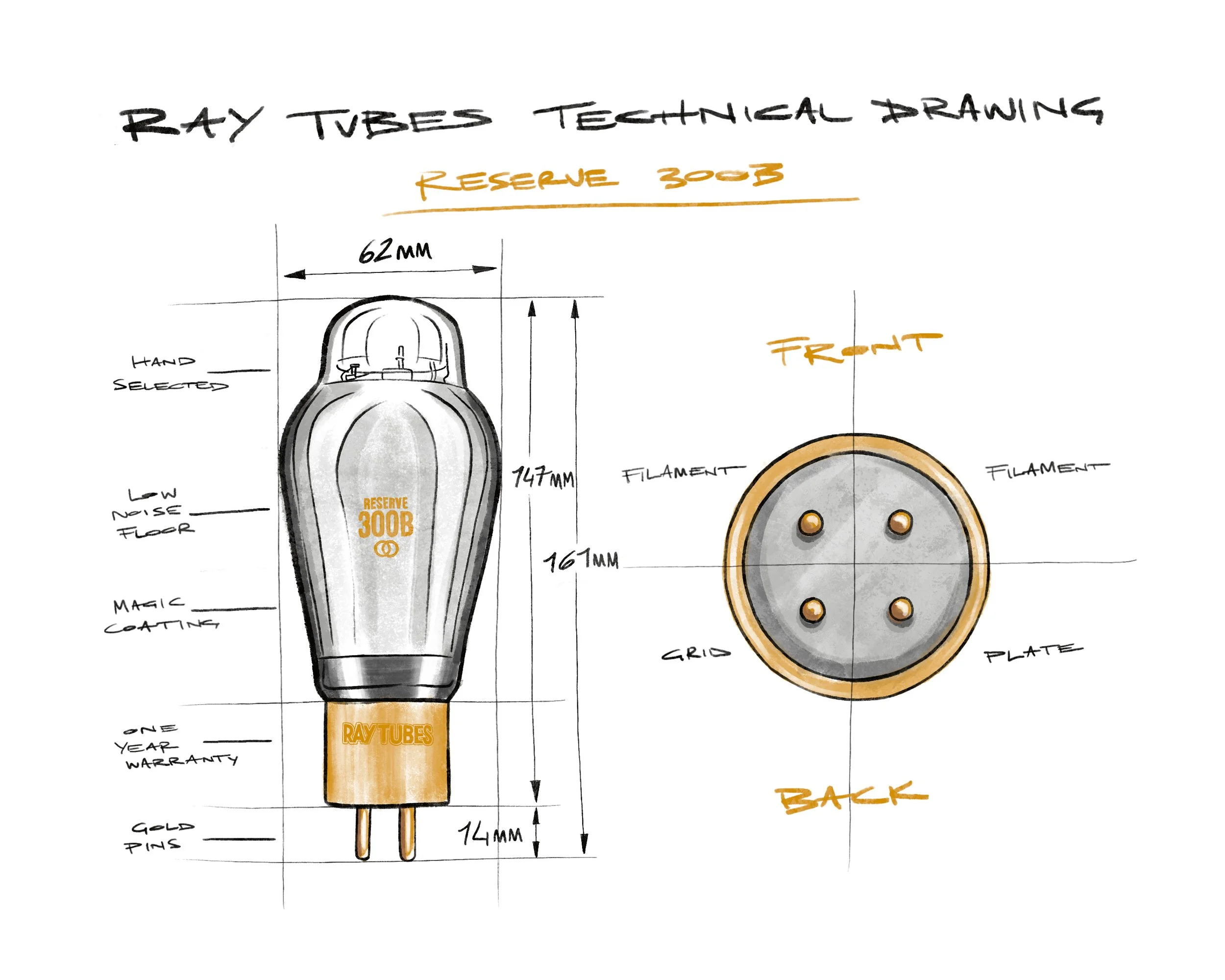
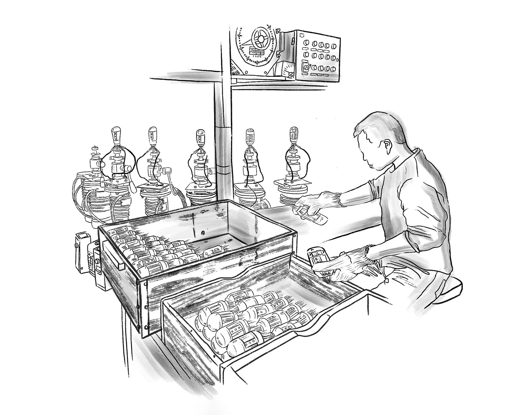
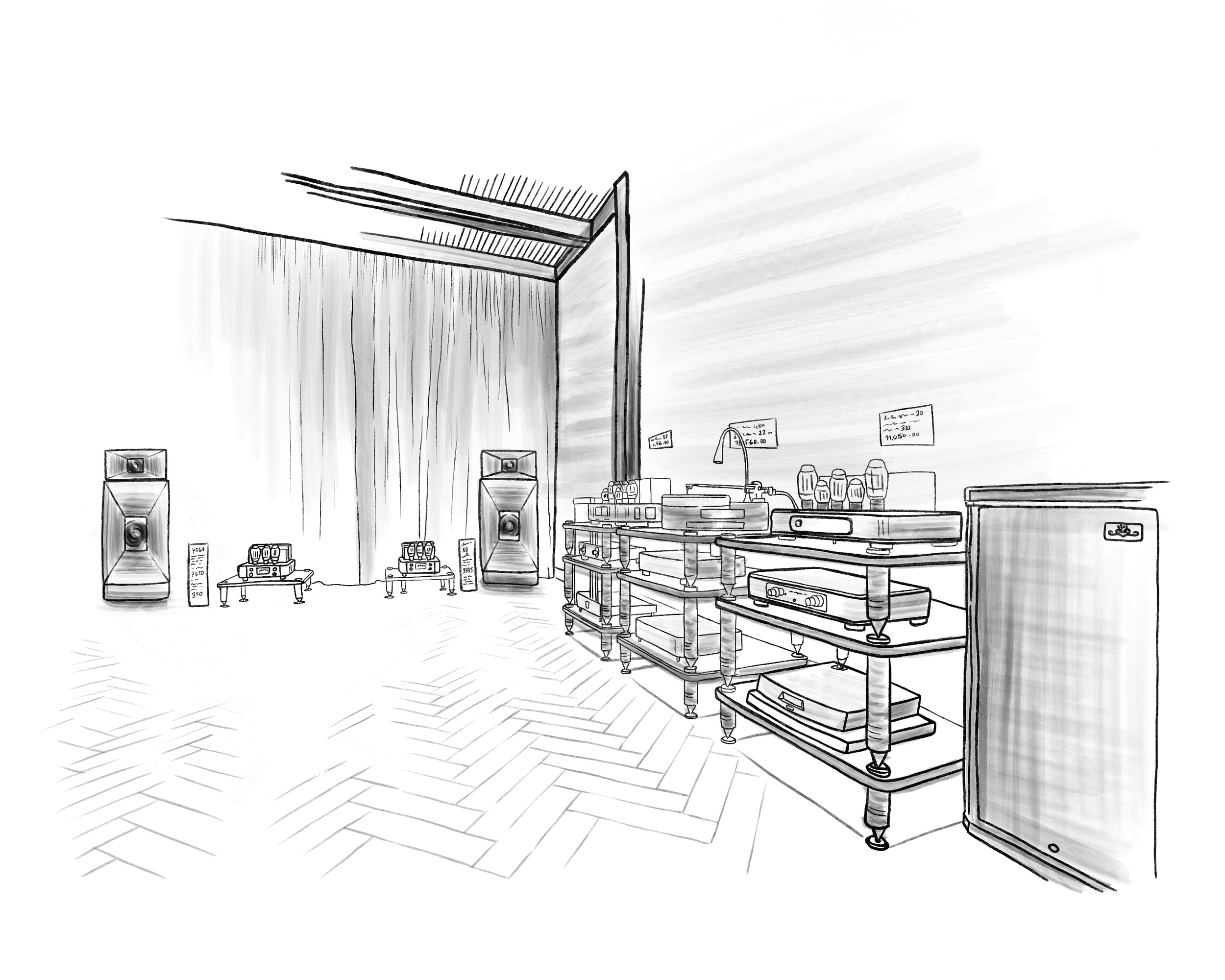
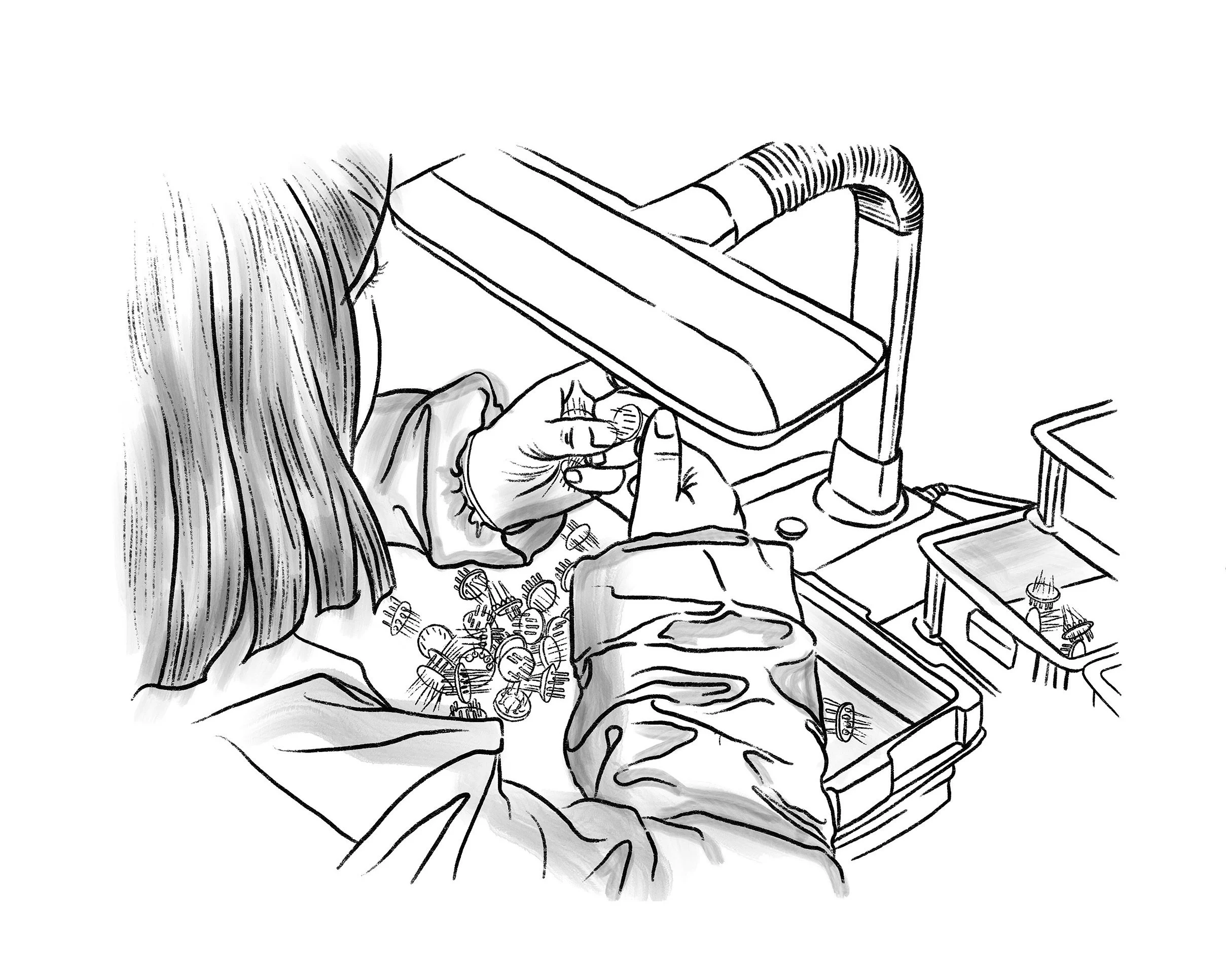
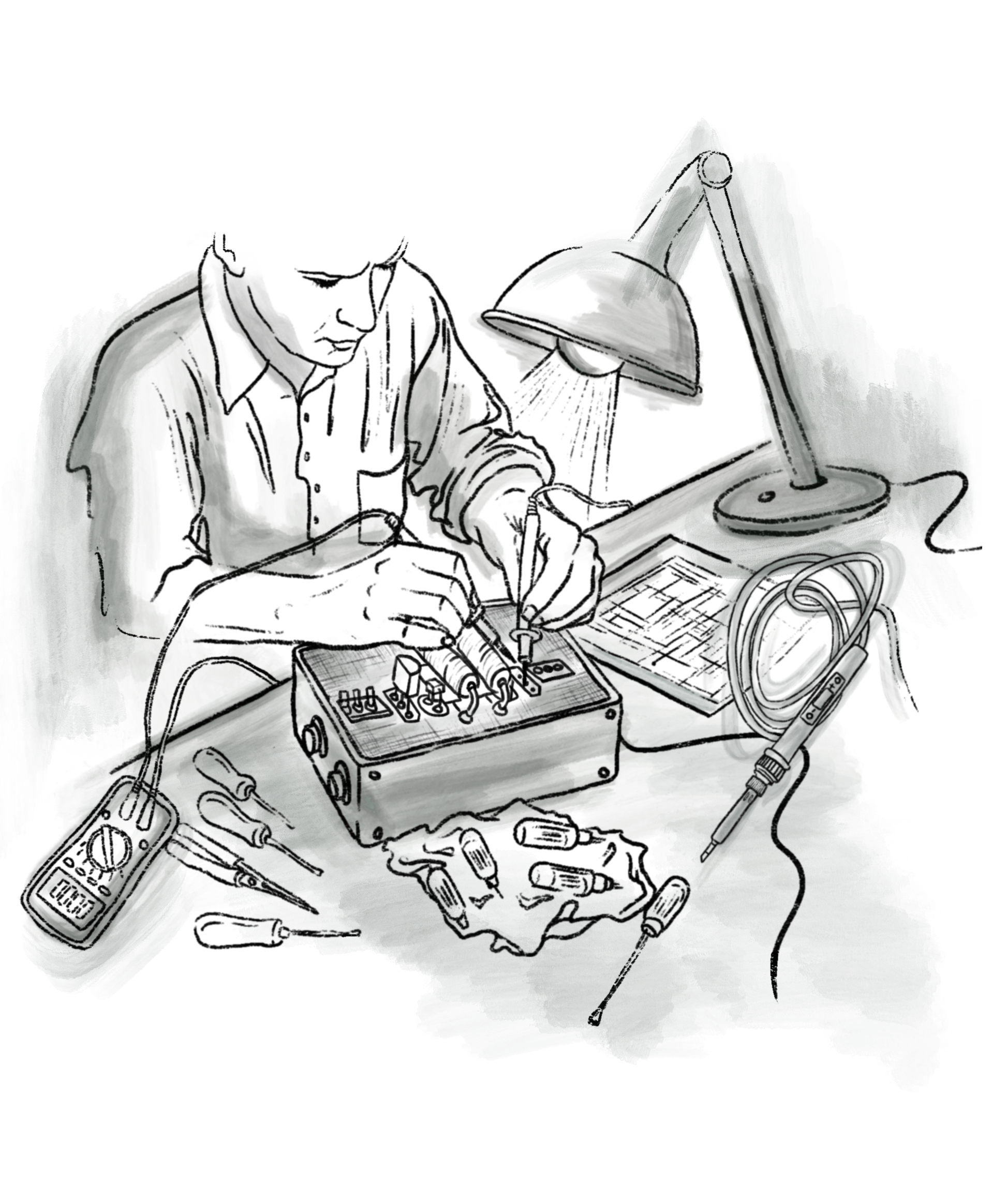
CREATIVE DIRECTION: Izzy Cammareri
PHOTOGRAPHY: Carla Iurato
CLIENT: SARAH & SEBASTIAN, a fine jewellery studio based in Sydney.
PROJECT PURPOSE: A black and white photo series for a blog article spotlighting the brand’s icons and most loved designs.
CONCEPT: Presenting pieces through a monumental and elevated lens, using high contrast lighting with natural sunlight to emphasize shadows and highlights, as well as minimalist props and textures to create contours and curves, reflecting the unique details and silhouettes of each piece.
DISTRIBUTION: Instagram, blog and paid ads.


CREATIVE DIRECTION: Izzy Cammareri
PHOTOGRAPHY: Carla Iurato
CLIENT: SARAH & SEBASTIAN, a fine jewellery studio based in Sydney.
PROJECT PURPOSE: A still life photo series for a step-by-step blog post on how to clean and care fine jewellery.
CONCEPT: Bold, saturated visuals communicating each step in the guide, designed to work
as a cohesive story or as elevated individual images spotlighting the jewellery.
DISTRIBUTION: Instagram, blog and paid ads.


CREATIVE DIRECTION: Izzy Cammareri & Carla Iurato
PHOTOGRAPHY: Carla Iurato
CLIENT: SARAH & SEBASTIAN, a fine jewellery studio based in Sydney.
PROJECT PURPOSE: Portraits of model, free diver and ocean conservationist Astrid Holler for a blog interview feature.
CONCEPT: Capturing Astrid wearing Sarah & Sebastian pieces in her natural element – swimming in the ocean amongst kelp and rock pool formations – aligning with her interview answers and story.
DISTRIBUTION: Instagram and blog.


CREATIVE DIRECTION: Izzy Cammareri & Carla Iurato
PHOTOGRAPHY: Carla Iurato
CLIENT: SARAH & SEBASTIAN, a fine jewellery studio based in Sydney.
PROJECT PURPOSE: A still life photo series for a blog post focusing on the brand’s ocean-inspired jewellery pieces.
CONCEPT: A mix of clean, minimalist flat lays and textural shots inspired by ocean hues and elements, featuring found shells.
DISTRIBUTION: Instagram, blog and paid ads.


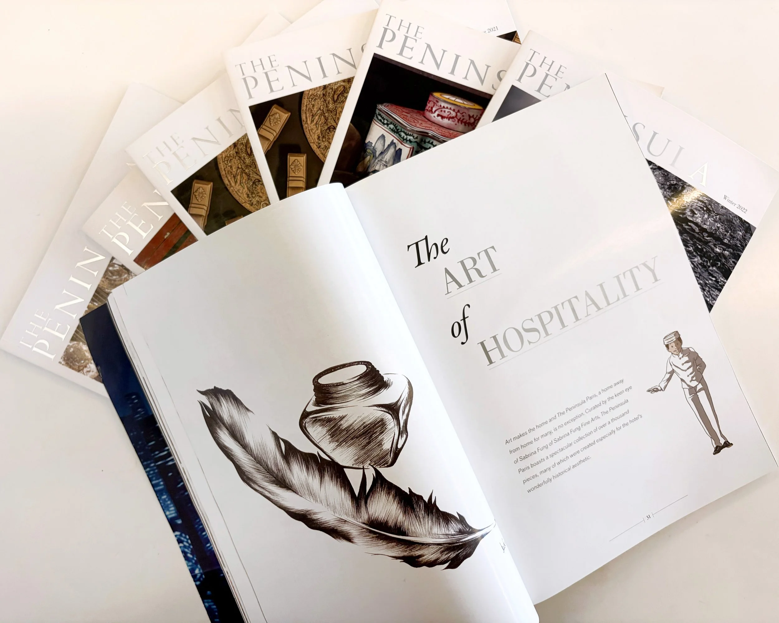
LAYOUT DESIGN
CLIENT: Luxury publishing house The Antithesis, based in Hong Kong.
PROJECT DATES: 2021–2025
PURPOSE: End-to-end magazine layout design for The Peninsula magazine, a quarterly print publication for the five-star Peninsula Hotels group.
DISTRIBUTION: Peninsula Hotels worldwide.


LAYOUT DESIGN
CLIENT: Luxury publishing house The Antithesis, based in Hong Kong.
PROJECT DATES: 2022, 2023, 2024, 2025
PURPOSE: End-to-end magazine layout design for The Quail magazine, an annual luxury motorsports print title.
DISTRIBUTION: The Quail Lodge and Golf Club luxury Motorsports events.


GRAPHIC DESIGN & DIGITAL ILLUSTRATION
CLIENT: Luxury publishing house The Antithesis, based in Hong Kong.
PROJECT DATE: 2022
PURPOSE: End-to-end layout design and original illustrations for an archival menu, created for The Peninsula Hong Kong’s iconic Gaddi’s restaurant.
DISTRIBUTION: Gaddi’s, The Peninsula Hotel Hong Kong.


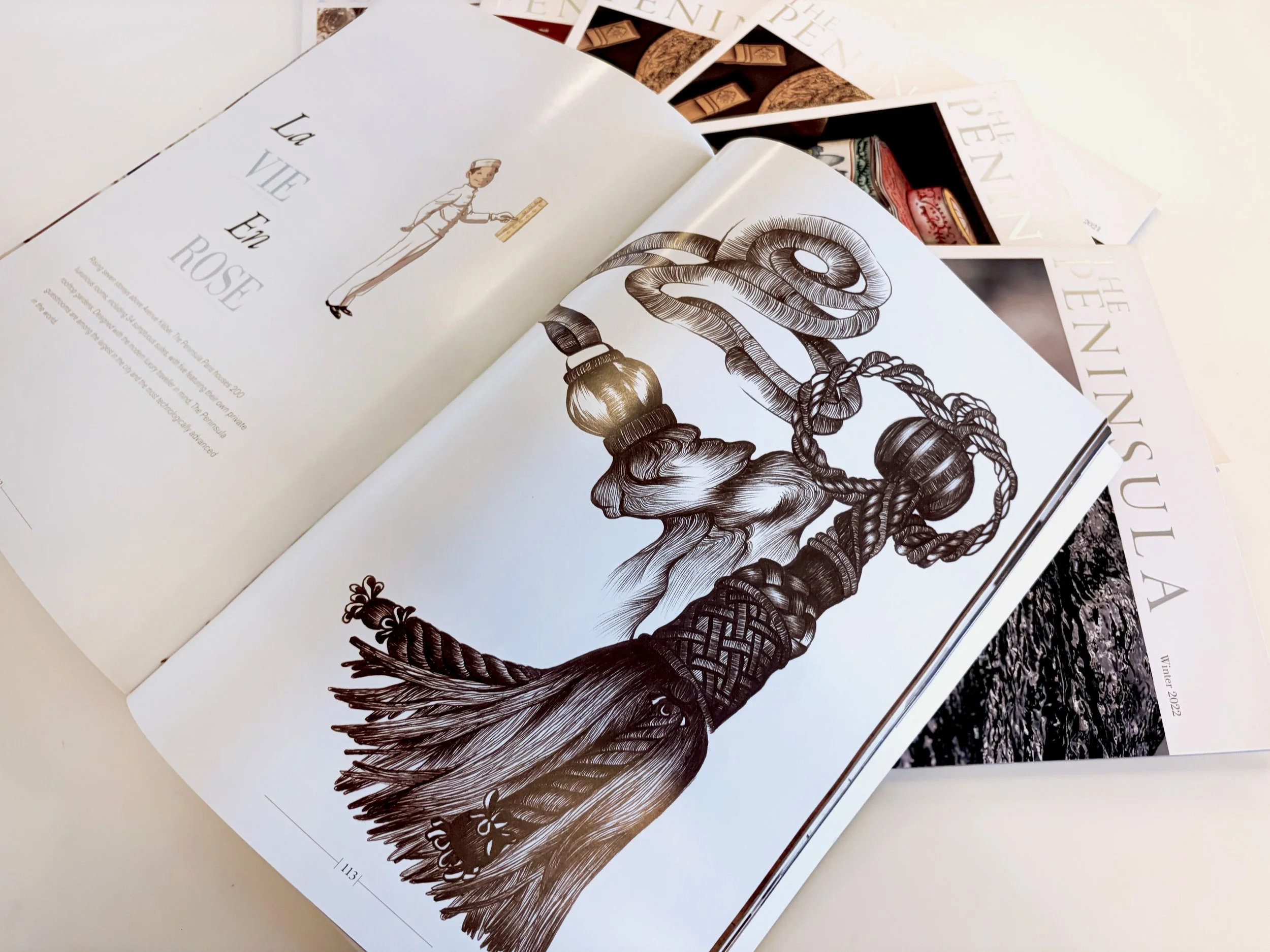
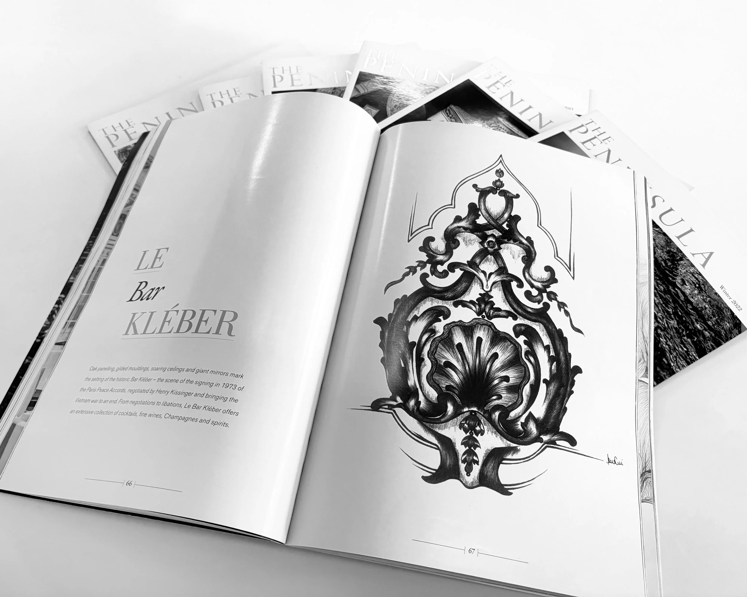
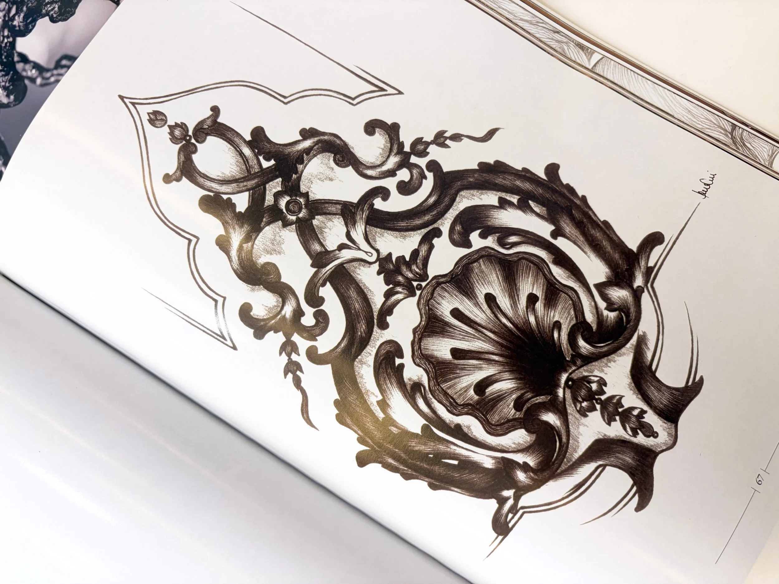
HAND-DRAWN ILLUSTRATIONS
CLIENT: The Peninsula magazine
MEDIUM: Ballpoint Pen on Paper
PROJECT DATE: 2012
PROJECT PURPOSE: Original illustrations for a special edition of the The Peninsula’s quaterly print magazine.
DISTRIBUTION: The Peninsula Hotels world wide.
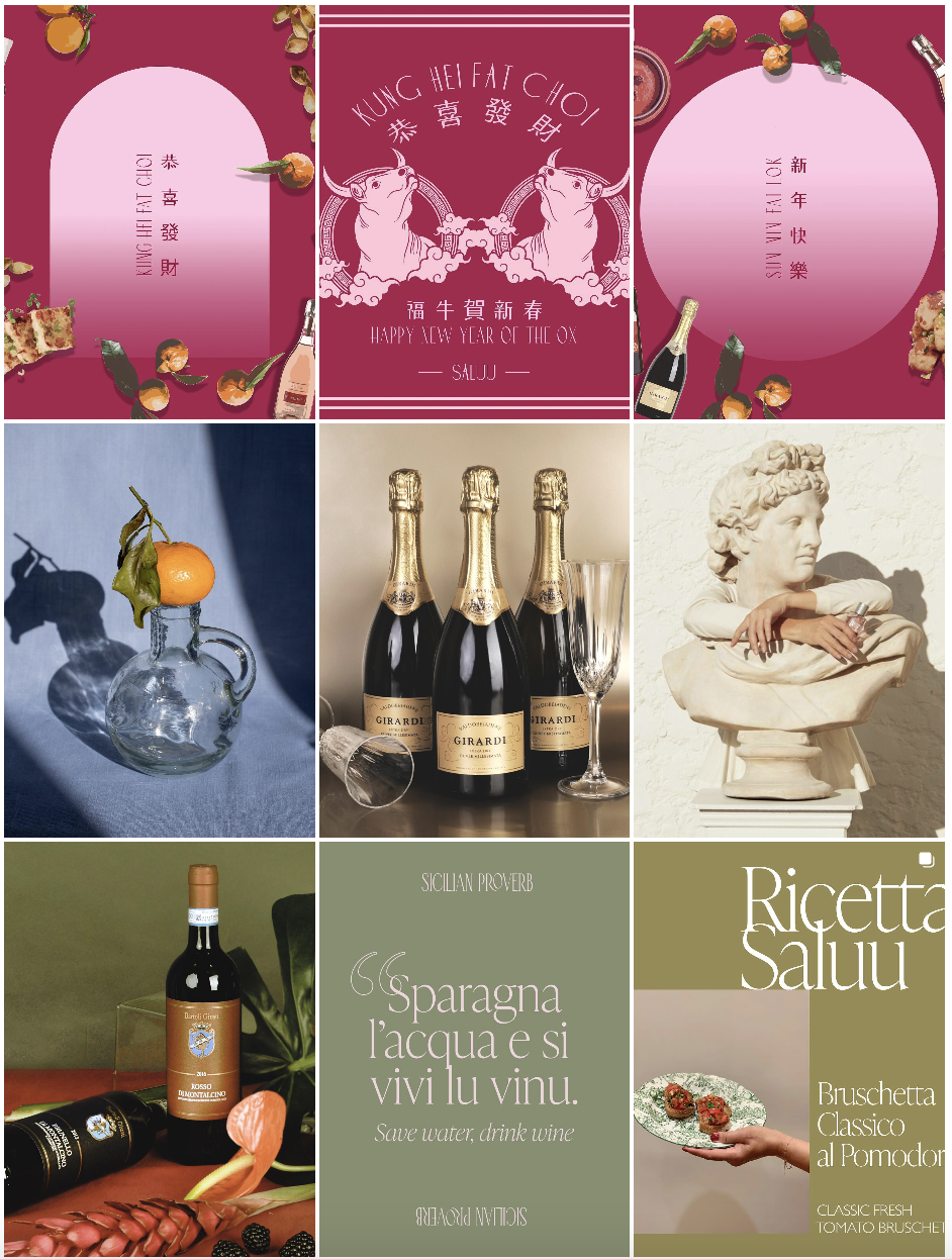
CREATIVE DIRECTION, OVERARCHING BRAND STRATEGY & PRODUCTION
CLIENT: SALUU, a start-up wine e-commerce platform based in Hong Kong.
PROJECT PURPOSE: Developed the brand’s visual identity, drove the social and website content strategy and production (graphic design, photography, layout design, UX optimisations).
DISTRIBUTION: Instagram and website.